Mack trucks are known for being ready to take whatever the world throws at them. It’s this can-do spirit we wanted to build on when we helped the American company re-launch their brand. The re-brand came complete with a new look, feel, and tagline: Born Ready.
But what does “Born Ready” mean, exactly? Mack employees felt their hard work and drive for results reflected in the phrase, but they couldn’t quite articulate its application—so we helped.
Through a series of interviews with Mack employees, we created ten unique stories. Leveraging their own experiences, we were able to help employees find the words to define the brand.
©VSA Partners
You can’t talk about the best hospitals in Chicago (or the nation) without talking about Rush. When this century-old, nationally ranked health care system came to us for a re-brand, we knew we had to deliver a look and voice befitting their industry position.
We began by providing a revitalized color palette and a fresh tagline, “Excellence is just the beginning.” These changes gave Rush two strong elements it can proudly own in the space: green and excellence. They took center stage as we designed and rolled out brand kits, outdoor advertising, environmental graphics, commercials, and social media—just to name a few.
©Remedy
Before there were direct messages, there was another type of DM: direct mail.
Fine paper company Sappi was looking for an inspiring and interactive way to display their new web cover stock. We designed a carrying case that tells audiences to respect the 5 Second Rule—which is how long it takes consumers to decide whether they’ll toss a direct mail piece or take a closer look.
The case outlines the paper’s top four selling points and contains four sample direct mail pieces that talk about the points in more detail.
(If you’ve never tried to make a direct connection between pizza and paper weight, it’s not as easy as it sounds.)
©VSA Partners
Mack’s 2014 rebrand opened the door for the company to reintroduce their products in a new style with a fresh voice. We focused on Mack’s three major markets—construction, highway, and refuse—to tell the story of the 21st century Mack truck.
©VSA Partners
The world’s largest privately owned company was preparing to ring in 150 years, and they needed a party planner of sorts to figure out how to help them celebrate.
Instead of baking Cargill a cake, we built a microsite that features 150 unique stories demonstrating the company’s history, diversity, and range of influence.
The celebration grew to include a commemorative coffee table book, full-wall airport advertisements, and advertorials in National Geographic, to name a few. Let’s just say Cargill got everything on its birthday list that year.
©VSA Partners
Forget what you’ve heard—creative types aren’t difficult to work with; we just pay attention to the details. Like, ridiculously close attention. This running joke became the starting point for a campaign targeting young creatives at a design conference.
The Eames cards, printed on Sappi McCoy paper, call out things detail-oriented designers (Obsessive Compulsive Designers, if you will) just wouldn’t do, like let their CTA go MIA.
The idea is that great design lives and dies in the details, and every ingredient in a successful brand is critical—including paper choice.
©VSA Partners
It’s not every year that an organization turns 140. To celebrate the milestone, YWCA Chicago wanted to make a splash around the city. The non-profit, which is focused on eliminating racism and empowering women, specifically asked what we could do to help differentiate them from a non-profit of a *ahem* similar name.
So, a collaborative group of female (and a few male) creatives huddled up and began asking each other, “What makes the YWCA different?” The answer was simple: the “W”.
The letter became the focus of a multi-dimensional campaign that brought recognition to the non-profit and made a statement about the importance of women in our city.
©VSA Partners
The Illinois Medical District is a global healthcare innovation community in the city of Chicago. Located just two miles from downtown and consisting of four major health systems and 40+ healthcare-related facilities, it seemed to be Chicago’s best kept secret. But the IMD was ready break the silence and market itself to a new set of healthcare innovators—with a new website.
Our first task was to define the IMD’s story so that we could demonstrate its value and attract prospective partners. We designed the site to answer three key questions: Who is the IMD? Where is the IMD? What is the purpose of the IMD? I audited their current site, organized content, created a sitemap, designed wireframes, and worked closely with designers and developers to bring the new IMD website to life.
©Remedy
As the cultural stigma around mental health shifts and more people seek help, there’s a growing need to address how treatment is covered. It turns out, most health insurance plans actually cover treatment for mental health and addiction, but many people aren’t aware either because it’s not widely publicized or because they’ve been denied coverage in the past.
The Kennedy Forum, a non-profit leading the way in the mental health addiction space, identified the need to educate the public on this issue and turned to us to help raise awareness and inspire action.
To kick off the project, we hosted The Kennedy Forum and thought leaders in the space. The goal was to understand the problem and align on the most effective way to communicate our message: that most people with health insurance have mental health and addiction coverage—and the legal right to use it.
The key output of the strategy session was the campaign line, “Don’t deny me.” This simple, straightforward, yet powerful, phrase became the cornerstone of our creative work, positioning it as the rallying cry for any individual or family who has ever been denied their right to treatment.
©Remedy
When Sappi decided to brand their EuroArt Plus paper, we knew there was a fine line between a favorable outcome and a flop.
We welcomed the paper into Sappi's "fine line"-branded family, focusing on its key selling points to position it to make a major impact within the space.
EuroArt Plus—the fine line between bulk and brawn.
©VSA Partners
Every year, Sappi paper company holds its Printer of the Year competition, inviting organizations to submit their most impactful print pieces for a shot at $20,000 in branding and marketing support. And every year we’re tasked with thinking up a compelling concept that inspires people to send Sappi their best work.
In 2017, we created a three-part mailing series. Each piece had dual meaning, making a connection between part of the print process—like “make-ready” and “finish”—and the race to become Sappi’s Printer of the Year.
©VSA Partners
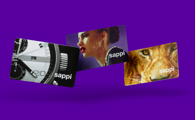
People don’t necessarily think paper when they think gift cards, so Sappi paper set out to change that in the name of sustainability.
To help market the paper company’s new gift card stock we created three cards and holders—each of which demonstrates a distinct Sappi selling point—showing that anything plastic can do paper can do better.
©VSA Partners